
Building a newsletter layout is much more limited than setting up a common website. Newsletters should be kept as simple as possible, and not aim to duplicate regular websites in terms of functionality and design.
E-mail clients are simply not as developed as browsers and they have limited support for advanced HTML and CSS. In addition they render very different, so something that works in one client does not necessarily work in another. Therefore it is always important to test templates thoroughly. Isave AS tests templates through Email On Acid.
It has also become very important to customize for various platforms. (PC monitors in different sizes, tablet, mobile, etc.). This is what we call responsive design.
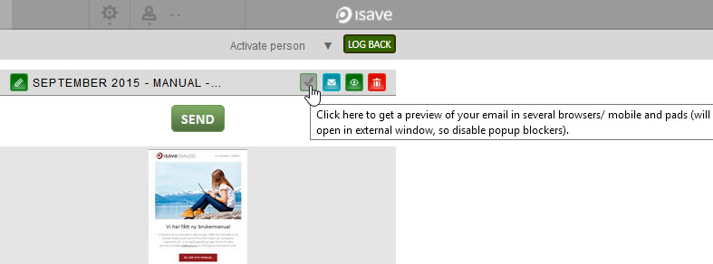
You can find our mail client test (Email on Acid) above the preview of your newsletter. This will be opened in a new window.
How should the newsletter look like?
E-mails must be simple and easy to understand. A concentrated version of the text that you want to spread. If there is a lot of text to be communicated, use a landing pages linked from the newsletter.
Top banner
The first thing that greets you when you open the newsletter is often the top banner. With design customized for mobile it is important that this is not too much nonsense. It is important that the message in the e-mail appears in the first screen also on the mobile, and if top banner takes too much space, this will be pushed down. Create a top banner that is concrete and clear.
Heading
Under the top banner you should have a clear headline that describes what your newsletter contains. The headline must therefore be descriptive and specific.
Columns
It is recommended with one column in newsletters because it controls the reader to read the cases in order of priority. At less useful news you can consider 2 columns.
Footer
It is mandated by the Marketing law to have a opt out link in all mailings. This is often laid in the footer. Read what the law says about e-mail and SMS marketing.
Images in newsletters
Not all e-mail clients download images automatically. This means that users have to click on “download images”. It is therefore important that the newsletter looks fairly good and are readable even if images are not displayed. This means for example that it is not recommended to put important information on images.
Text in newsletters
1. The font size in a newsletter should not be less than 10 px, preferably 12 px.
2. Use web-safe fonts. This is fonts that all e-mail clients support. The web-safe fonts are: Arial, Trebuchet, Verdana, Comic Sans MS, Courier New Georgia, Impact and Times New Roman. If you absolutely want to use other fonts, it is possible to add them as images (but notice that images are not always visible), or you can import the font and use a web-safe font as a support font for those clients where the first font is not working. Note that this is in most clients.
3. Only use color and underline on links in the body text. Text that is underlined will often be incorrectly perceived as links.
4. Do not put important text in images.
5. Lines of text should be no more than about 55 characters in width.
Design adapted to mobile
Over 50% of e-mails today is opened on mobile or tablet. There are no longer any excuses for not creating designs that are customized for all platforms. This is slightly more complicated, but the design will be more user friendly.
When it comes to mobile design, it is important to think about:
1. Say the most important first
In mobile you don’t have that much space, and it is important that your message will show up without scrolling. Try to place important call-to-action element available as well.
2. Adjust the text specifically for mobile
It is recommended to have a font size of at least 13 px on mobile.
3. Buttons should be at least 44×44 px
For buttons to be easy to click, they should be at least 44×44 px which is about as big as a thumb.
4. Have specific content
When the space is tight, you must be careful with the content. Hide the things that are unnecessary on mobile, and go through the text carefully to ensure that it is relevant and specific enough. Too much text will cause that the users don’t want to read it.
5. Keep it simple
The mobile view of an e-mail should never be anything other than one column. Otherwise, text and images will be very small and difficult to see. It is not particularly clean either, but messy. Users are accustomed to one-column on mobile and that is what is most user-friendly and understandable.
These elements often creates trouble in newsletters
1. Background images
2. Photos and text overlapping
3. Graphics used to build a frame around a box
4. Flash
5. Forms
6. More than two columns beside each other
7. Newsletter of width greater than 640px
Design code in newsletters
To ensure maximum compatibility with the e-mail clients, it is necessary to build up the template with HTML tables.
CSS must be used with caution. CSS are added inline and / or locally in tag. Here is a list of what CSS works and not in the different e-mail clients.
Do you need help with your e-mail design, please contact us in Isave AS, so we can help! We offer ready-made generic templates or we can help you create your own custom template for your business.
Related links:
Images in responsive templates
How to add an eDM template
What does the law say about e-mail and SMS marketing?


Leave A Comment?